[에스비지] SVG -(11편)- 그라디언트 만들기 (Gradient) (feat. 화면중앙정렬, linearGradient, radialGradient, stop, offset, stop-color, <![CDATA[ ]]>)
그라디언트 만들기
Gradient
오늘 알아야 할 핵심 키워드는 바로바로!!
linearGradient
radialGradient
stop
offset
stop-color
그동안 svg 태그를 불러와 사용했다면,
이번에는 object 태그로 svg를 불러와 사용을 해보고자 한다.
이게 무슨말인가 하면,
https://blog.naver.com/nicholasdw/222223307910
[에스비지] SVG (Scalable Vector Graphics) -(01편)(viewBox, 압축하기)
#svg #scaleableVectorGraphics#확장가능벡터그래픽#벡터그래픽SVG vs. CanvasSVG를 HTML...
blog.naver.com
여기에 svg를 문서안에 넣는 여러가지 방법들! 이란 파트가 있다.
거기서 한번 개념을 짚고 다시 돌아오면 좋다.
예전시간에 만들었던,
https://blog.naver.com/nicholasdw/222225947902
[에스비지] SVG (Scalable Vector Graphics) -(02편)- CSS적용하기 (feat. fill, transform-origin,nth-of-type)
#svg #scaralableVectorGraphics #확장가능벡터그래픽 #벡터그래픽이번에 할 새로운 것에 앞서, 새로운...
blog.naver.com
이 친구를 기억하나 모르겠지만,
이 친구를 데려오겠다.
이번에는 저 친구의 머리색을 바꿀 것인데, circle이 여러개여서,
하나로 병합해서 새로 저장을 해서 가져왔다.
<!DOCTYPE html>
<html lang="ko">
<head>
  <meta charset="UTF-8">
  <meta http-equiv="X-UA-Compatible" content="IE=edge">
  <meta name="viewport" content="width=device-width, initial-scale=1.0">
  <title>SVG Gradient 만들기</title>
</head>
<body>
  <object data="face_hair.svg" type="image/svg+xml"></object>
</body>
</html>
이대로 사용하면, 화면에 너무 가득차기 때문에,
<!DOCTYPE html>
<html lang="ko">
<head>
  <meta charset="UTF-8">
  <meta http-equiv="X-UA-Compatible" content="IE=edge">
  <meta name="viewport" content="width=device-width, initial-scale=1.0">
  <title>SVG Gradient 만들기</title>
  <style>
    .face_hair_object {
      width: 200px;
      position: absolute;
      left: 0;
      top: 0;
      right: 0;
      bottom: 0;
      margin: auto;
    }
  </style>
</head>
<body>
  <object class="face_hair_object" data="face_hair.svg" type="image/svg+xml"></object>
</body>
</html>
오브젝트에 class명을 주고,
css로 크기를 조절하고,
(크기 조절은 한쪽만 잡아주면 나머지 한쪽은 비율대로 정해진다.
두개다 따로 정해주면 그 크기대로 맞춰진다.)
화면 중앙에 위치하였다.
화면 중앙에 위치하는 방법은
대략 3가지가 있다.
알고들 있겠지만,
1.
1분코딩님을 통해 알게 된 방법이다.
position: absolute;
left: 0;
right: 0;
top: 0;
bottom: 0;
margin: auto;
상하좌우 위치를 0으로 잡은 상태에서 마진을 상하좌우 auto를 주면 중앙에 배치.
2.
가장 흔한방법.
position: absolute;
left: 50%;
top: 50%;
transform: translate(-50%, -50%);
3.
flex나 grid 활용
display: flex; (혹은 grid)
justify-content: center; (수평 중앙정렬)
align-items: center; (수직 중앙정렬, 단 높이 값이 있어야 한다.)
height: 100vh;
기본적으로 인라인이나 인라인블록 혹은 인라인의 성질을 띄지 않는 이상
너비값은 기본이 100%로 화면 가득 채우기 때문에,
너비값을 따로 안적어줘도 되지만,
높이값은 따로 지정하지 않으면,
컨텐츠의 크기만큼 늘어나는 것이기에,
높이값을 따로 지정해야 수직 중앙정렬을 해도 눈에 변화가 보인다.
돌아와서,

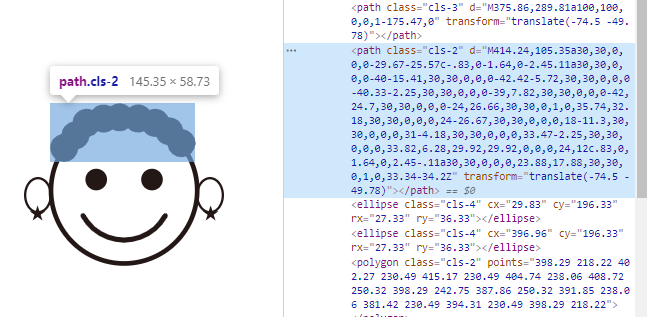
그럼 저 path에게 gradient를 입혀보자.
그것은 svg 파일 자체를 고쳐야 할것이다.
링크를 걸었던 face_hair.svg 로 들어가 고치자.
<svg id="레이어_1" data-name="레이어 1" xmlns="http://www.w3.org/2000/svg" viewBox="0 0 426.79 347">
  <defs>
    <style>
    .cls-1,.cls-3,.cls-4{fill:none;stroke:#231815;stroke-miterlimit:10;}
    .cls-1{stroke-width:10px;}
    .cls-2{fill:#231815;}
    .cls-3{stroke-linecap:round;stroke-width:11px;}
    .cls-4{stroke-width:5px;}
    </style>
  </defs>
  <title>face_hair</title>
  <circle class="cls-1" cx="213.63" cy="186" r="156"/>
  <circle class="cls-2" cx="273.13" cy="162.94" r="23.06"/>
  <circle class="cls-2" cx="154.13" cy="162.94" r="23.06"/>
  <path class="cls-3" d="M375.86,289.81a100,100,0,0,1-175.47,0" transform="translate(-74.5 -49.78)"/>
  <path class="cls-2" d="M414.24,105.35a30,30,0,0,0-29.67-25.57c-.83,0-1.64,0-2.45.11a30,30,0,0,0-40-15.41,30,30,0,0,0-42.42-5.72,30,30,0,0,0-40.33-2.25,30,30,0,0,0-39,7.82,30,30,0,0,0-42,24.7,30,30,0,0,0-24,26.66,30,30,0,1,0,35.74,32.18,30,30,0,0,0,24-26.67,30,30,0,0,0,18-11.3,30,30,0,0,0,31-4.18,30,30,0,0,0,33.47-2.25,30,30,0,0,0,33.82,6.28,29.92,29.92,0,0,0,24,12c.83,0,1.64,0,2.45-.11a30,30,0,0,0,23.88,17.88,30,30,0,1,0,33.34-34.2Z" transform="translate(-74.5 -49.78)"/>
  <ellipse class="cls-4" cx="29.83" cy="196.33" rx="27.33" ry="36.33"/>
  <ellipse class="cls-4" cx="396.96" cy="196.33" rx="27.33" ry="36.33"/>
  <polygon class="cls-2" points="398.29 218.22 402.27 230.49 415.17 230.49 404.74 238.06 408.72 250.32 398.29 242.75 387.86 250.32 391.85 238.06 381.42 230.49 394.31 230.49 398.29 218.22"/>
  <polygon class="cls-2" points="28.96 218.22 24.98 230.49 12.08 230.49 22.51 238.06 18.53 250.32 28.96 242.75 39.39 250.32 35.4 238.06 45.83 230.49 32.94 230.49 28.96 218.22"/>
</svg>
자 여기에서 바꿔주면 된다.
<defs></defs>
여기 안에
<linearGradient></linearGradient>
를 적어준다.
선형그라디언트이다.
왼쪽에서 오른쪽으로 주욱 선을 따라 그라디언트가 생성된다고 생각하면 된다.
여기에서 색일 입힐 때 또 필요한 것이
<stop></stop>
이라는 태그다.
그럼 이 stop에 offset 속성으로 위치를 잡아주고(0~100%, 시작점과 끝점사이)
stop-color 속성으로 색상을 지정해주면 되는데, rgb나 rgba 또는 hex 코드형식, 단어형식 모두 가능하다.
예) rgb(255,255,0) 또는 #ffff00 또는 yellow
<defs>
    <style>
    .cls-1,.cls-3,.cls-4{fill:none;stroke:#231815;stroke-miterlimit:10;}
    .cls-1{stroke-width:10px;}
    .cls-2{fill:#231815;}
    .cls-3{stroke-linecap:round;stroke-width:11px;}
    .cls-4{stroke-width:5px;}
    </style>
    <linearGradient>
      <stop offset="0%" stop-color="yellow"></stop>
      <stop offset="50%" stop-color="hotpink"></stop>
      <stop offset="100%" stop-color="deepskyblue"></stop>
    </linearGradient>
  </defs>
이런식으로 한다는 뜻이다.
그럼 이걸 참조해야하니 연결 시켜줘야 한다.
linearGradient에 id 값을 주고
내가 변화를 줄 path에 class명을 추가해
그것의 fill값을 연결 시킨다.
<svg id="레이어_1" data-name="레이어 1" xmlns="http://www.w3.org/2000/svg" viewBox="0 0 426.79 347">
  <defs>
    <style>
    .cls-1,.cls-3,.cls-4{fill:none;stroke:#231815;stroke-miterlimit:10;}
    .cls-1{stroke-width:10px;}
    .cls-2{fill:#231815;}
    .cls-3{stroke-linecap:round;stroke-width:11px;}
    .cls-4{stroke-width:5px;}
    .gradient-hair {
      fill: url('#gradient-hair');
    }
    </style>
    <linearGradient id="gradient-hair">
      <stop offset="0%" stop-color="yellow"></stop>
      <stop offset="50%" stop-color="hotpink"></stop>
      <stop offset="100%" stop-color="deepskyblue"></stop>
    </linearGradient>
  </defs>
  <title>face_hair</title>
  <circle class="cls-1" cx="213.63" cy="186" r="156"/>
  <circle class="cls-2" cx="273.13" cy="162.94" r="23.06"/>
  <circle class="cls-2" cx="154.13" cy="162.94" r="23.06"/>
  <path class="cls-3" d="M375.86,289.81a100,100,0,0,1-175.47,0" transform="translate(-74.5 -49.78)"/>
  <path class="cls-2 gradient-hair" d="M414.24,105.35a30,30,0,0,0-29.67-25.57c-.83,0-1.64,0-2.45.11a30,30,0,0,0-40-15.41,30,30,0,0,0-42.42-5.72,30,30,0,0,0-40.33-2.25,30,30,0,0,0-39,7.82,30,30,0,0,0-42,24.7,30,30,0,0,0-24,26.66,30,30,0,1,0,35.74,32.18,30,30,0,0,0,24-26.67,30,30,0,0,0,18-11.3,30,30,0,0,0,31-4.18,30,30,0,0,0,33.47-2.25,30,30,0,0,0,33.82,6.28,29.92,29.92,0,0,0,24,12c.83,0,1.64,0,2.45-.11a30,30,0,0,0,23.88,17.88,30,30,0,1,0,33.34-34.2Z" transform="translate(-74.5 -49.78)"/>
  <ellipse class="cls-4" cx="29.83" cy="196.33" rx="27.33" ry="36.33"/>
  <ellipse class="cls-4" cx="396.96" cy="196.33" rx="27.33" ry="36.33"/>
  <polygon class="cls-2" points="398.29 218.22 402.27 230.49 415.17 230.49 404.74 238.06 408.72 250.32 398.29 242.75 387.86 250.32 391.85 238.06 381.42 230.49 394.31 230.49 398.29 218.22"/>
  <polygon class="cls-2" points="28.96 218.22 24.98 230.49 12.08 230.49 22.51 238.06 18.53 250.32 28.96 242.75 39.39 250.32 35.4 238.06 45.83 230.49 32.94 230.49 28.96 218.22"/>
</svg>
일러스트에서 svg를 만들때 자동으로 class명이 생성되어 배치가 되었고 어느정도 꾸며졌었다.
그래서 class명으로 gradient-hair 를 추가하고
그걸로 css를 꾸며줄 때,
fill 값을 url로 그라디언트 id값을 연결시켜준것이다.
짠!!!

멋지지 않은가?
뭔가 인스타그램 로고 색상같기도 하다.
그럼 원형은 어떻게 할까?
linearGradient를 radialGradient로 바꿔보자.
<svg id="레이어_1" data-name="레이어 1" xmlns="http://www.w3.org/2000/svg" viewBox="0 0 426.79 347">
  <defs>
    <style>
    .cls-1,.cls-3,.cls-4{fill:none;stroke:#231815;stroke-miterlimit:10;}
    .cls-1{stroke-width:10px;}
    .cls-2{fill:#231815;}
    .cls-3{stroke-linecap:round;stroke-width:11px;}
    .cls-4{stroke-width:5px;}
    .gradient-hair {
      fill: url('#gradient-hair');
    }
    </style>
    <radialGradient id="gradient-hair">
      <stop offset="0%" stop-color="yellow"></stop>
      <stop offset="50%" stop-color="hotpink"></stop>
      <stop offset="100%" stop-color="deepskyblue"></stop>
    </radialGradient>
  </defs>
  <title>face_hair</title>
  <circle class="cls-1" cx="213.63" cy="186" r="156"/>
  <circle class="cls-2" cx="273.13" cy="162.94" r="23.06"/>
  <circle class="cls-2" cx="154.13" cy="162.94" r="23.06"/>
  <path class="cls-3" d="M375.86,289.81a100,100,0,0,1-175.47,0" transform="translate(-74.5 -49.78)"/>
  <path class="cls-2 gradient-hair" d="M414.24,105.35a30,30,0,0,0-29.67-25.57c-.83,0-1.64,0-2.45.11a30,30,0,0,0-40-15.41,30,30,0,0,0-42.42-5.72,30,30,0,0,0-40.33-2.25,30,30,0,0,0-39,7.82,30,30,0,0,0-42,24.7,30,30,0,0,0-24,26.66,30,30,0,1,0,35.74,32.18,30,30,0,0,0,24-26.67,30,30,0,0,0,18-11.3,30,30,0,0,0,31-4.18,30,30,0,0,0,33.47-2.25,30,30,0,0,0,33.82,6.28,29.92,29.92,0,0,0,24,12c.83,0,1.64,0,2.45-.11a30,30,0,0,0,23.88,17.88,30,30,0,1,0,33.34-34.2Z" transform="translate(-74.5 -49.78)"/>
  <ellipse class="cls-4" cx="29.83" cy="196.33" rx="27.33" ry="36.33"/>
  <ellipse class="cls-4" cx="396.96" cy="196.33" rx="27.33" ry="36.33"/>
  <polygon class="cls-2" points="398.29 218.22 402.27 230.49 415.17 230.49 404.74 238.06 408.72 250.32 398.29 242.75 387.86 250.32 391.85 238.06 381.42 230.49 394.31 230.49 398.29 218.22"/>
  <polygon class="cls-2" points="28.96 218.22 24.98 230.49 12.08 230.49 22.51 238.06 18.53 250.32 28.96 242.75 39.39 250.32 35.4 238.06 45.83 230.49 32.94 230.49 28.96 218.22"/>
</svg>
짠!!!

변화가 눈에 보이는가?
이것이다.
원형그라디언트는 offset 0%가 원의 중심이고
100%가 제일 가장자리라고 보면 될것이다.
0% 50% 100%의 기준점들에서 일정하게 영역을 갖고
그라데이션이 일어나는 것이다.
그리고 한번 더 짚고 넘어가는 것 하나
SVG 내부에서 CSS를 정의할 때,
xml parse 오류를 방지하기 위해서,
안전하게,
style태그 안에
<![CDATA[ ]]>
이 안에
css를 꾸미면 좋다고 한다.
<svg id="레이어_1" data-name="레이어 1" xmlns="http://www.w3.org/2000/svg" viewBox="0 0 426.79 347">
  <defs>
    <style>
    <![CDATA[
    .cls-1,.cls-3,.cls-4{fill:none;stroke:#231815;stroke-miterlimit:10;}
    .cls-1{stroke-width:10px;}
    .cls-2{fill:#231815;}
    .cls-3{stroke-linecap:round;stroke-width:11px;}
    .cls-4{stroke-width:5px;}
    .gradient-hair {
      fill: url('#gradient-hair');
    }
    ]]>
    </style>
    <radialGradient id="gradient-hair">
      <stop offset="0%" stop-color="yellow"></stop>
      <stop offset="50%" stop-color="hotpink"></stop>
      <stop offset="100%" stop-color="deepskyblue"></stop>
    </radialGradient>
  </defs>
  <title>face_hair</title>
  <circle class="cls-1" cx="213.63" cy="186" r="156"/>
  <circle class="cls-2" cx="273.13" cy="162.94" r="23.06"/>
  <circle class="cls-2" cx="154.13" cy="162.94" r="23.06"/>
  <path class="cls-3" d="M375.86,289.81a100,100,0,0,1-175.47,0" transform="translate(-74.5 -49.78)"/>
  <path class="cls-2 gradient-hair" d="M414.24,105.35a30,30,0,0,0-29.67-25.57c-.83,0-1.64,0-2.45.11a30,30,0,0,0-40-15.41,30,30,0,0,0-42.42-5.72,30,30,0,0,0-40.33-2.25,30,30,0,0,0-39,7.82,30,30,0,0,0-42,24.7,30,30,0,0,0-24,26.66,30,30,0,1,0,35.74,32.18,30,30,0,0,0,24-26.67,30,30,0,0,0,18-11.3,30,30,0,0,0,31-4.18,30,30,0,0,0,33.47-2.25,30,30,0,0,0,33.82,6.28,29.92,29.92,0,0,0,24,12c.83,0,1.64,0,2.45-.11a30,30,0,0,0,23.88,17.88,30,30,0,1,0,33.34-34.2Z" transform="translate(-74.5 -49.78)"/>
  <ellipse class="cls-4" cx="29.83" cy="196.33" rx="27.33" ry="36.33"/>
  <ellipse class="cls-4" cx="396.96" cy="196.33" rx="27.33" ry="36.33"/>
  <polygon class="cls-2" points="398.29 218.22 402.27 230.49 415.17 230.49 404.74 238.06 408.72 250.32 398.29 242.75 387.86 250.32 391.85 238.06 381.42 230.49 394.31 230.49 398.29 218.22"/>
  <polygon class="cls-2" points="28.96 218.22 24.98 230.49 12.08 230.49 22.51 238.06 18.53 250.32 28.96 242.75 39.39 250.32 35.4 238.06 45.83 230.49 32.94 230.49 28.96 218.22"/>
</svg>
참고하시라.